Timeline
Nov 2022 - Dec 2022
(3 Weeks)
Tools
Figma
Adobe Photoshop
Adobe Illustrator
Sketchbook
Skills
Barnding
Competitive Analysis
Visual Design
Wireframing
Context
Interaction Design at California College of the Arts,
IXDSN 2300 - Visual
Introduction
Project Goal
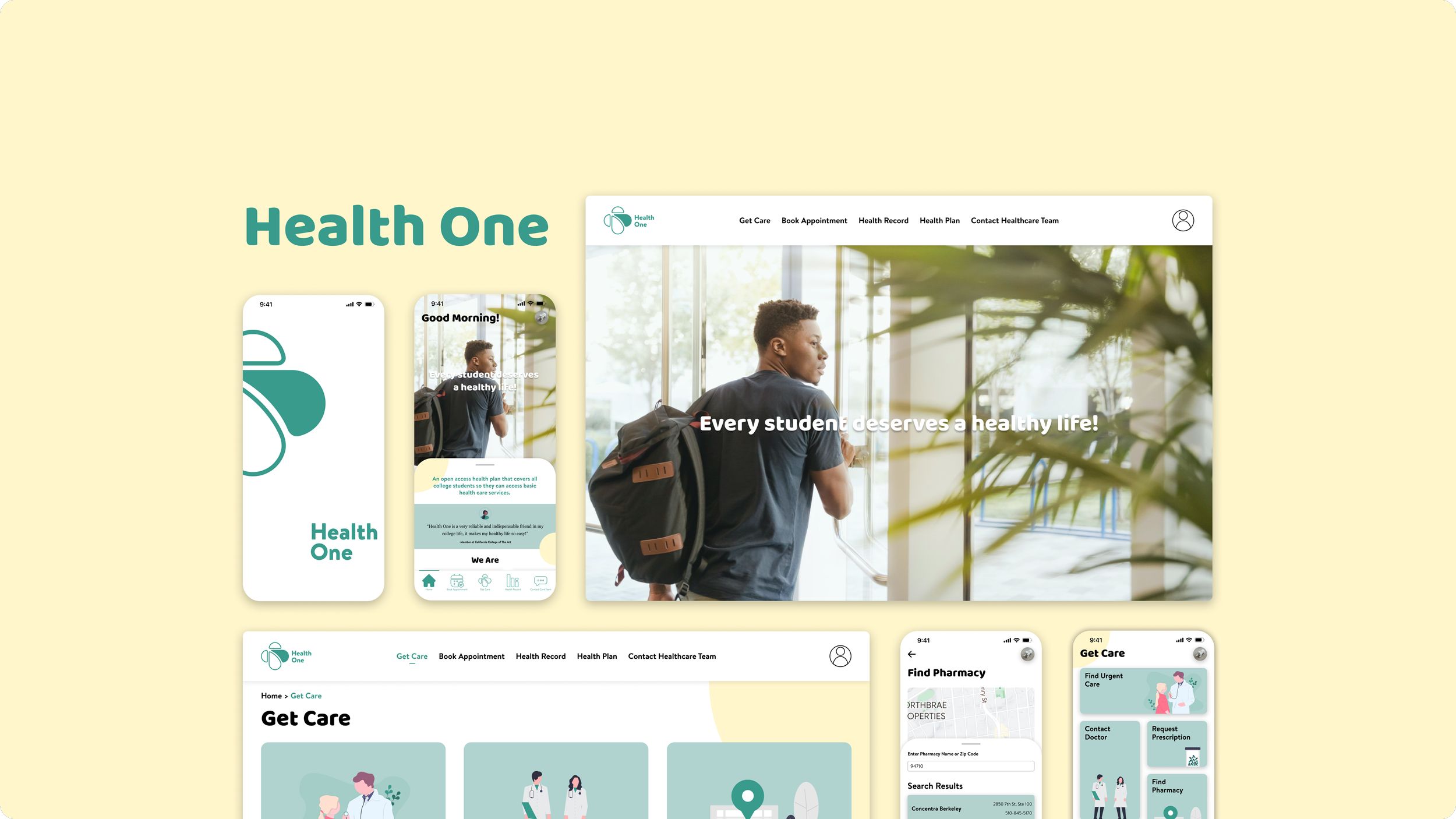
A brand's visual identity is pivotal in shaping user perception and fostering brand recognition. This project aimed to establish a brand new visual identity for Health One based on given information, leveraging advanced design skills to optimize the brand's visual experience across various touchpoints, including web, mobile, and print applications (Poster).
About Health One
Health One is a health care plans provider on the mission to provide open access health plans that cover all college students so they can access basic health care services;
Brand Value:
Enhance Connection | Strive for Economic Justice
Brand Personality:
Caring | Reliable | Affordable
Health One instills confidence in students facing health issues by offering timely, comprehensive healthcare services!
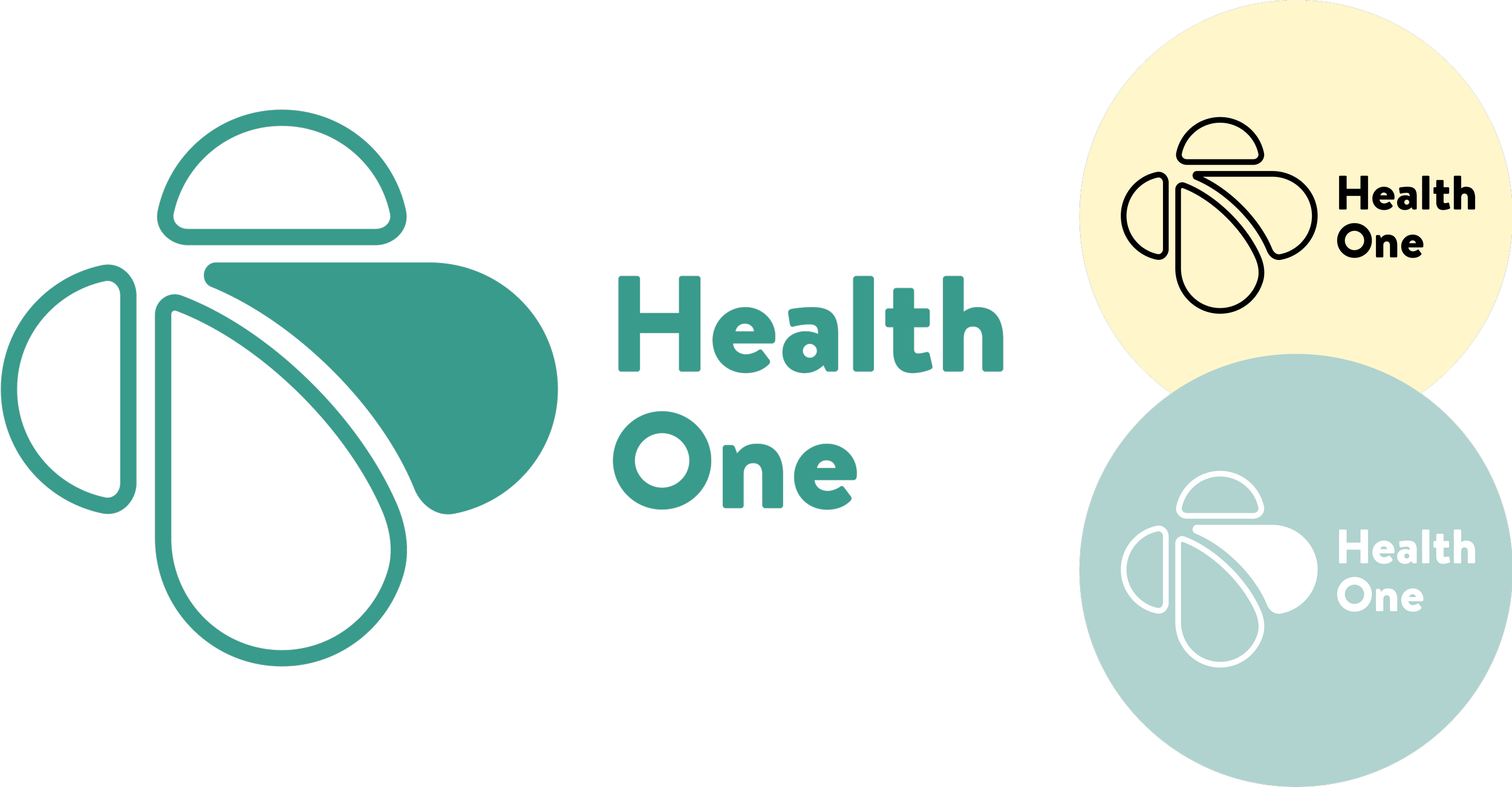
Health
One
Designs
Poster Design
Design Process
Brand Competitive Analysis
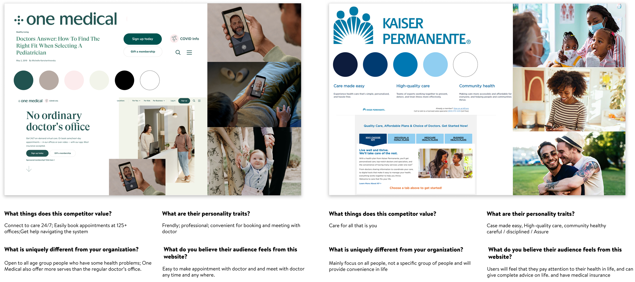
My design process began with a comprehensive competition analysis, focusing on prominent health insurance providers such as One Medical and Kaiser Permanente. This research involved an in-depth review of their websites to understand how they leverage brand identity to create distinct and memorable impressions on their audience.
Brand Positioning
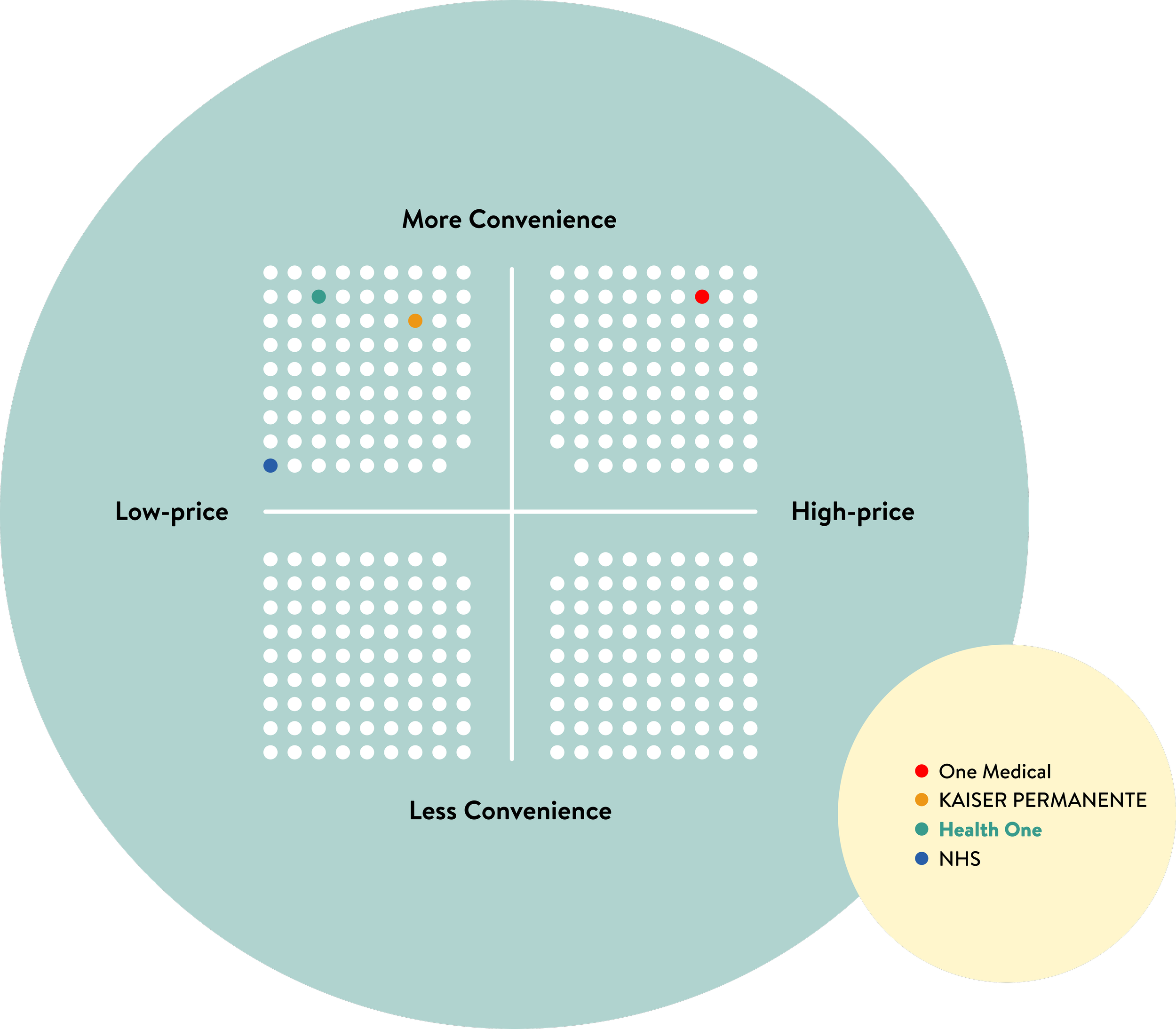
Following the competitive analysis, I employed the Brand Positioning Grid method to map out the market positions of my competitors and identify market gaps.
In contrast to our competitors, My vision of the brand is to provide convenience while easing the financial burden of accessing health care and ensuring they are able to pursue academic careers without being burdened by health-related issues.
📒 This approach was not just about positioning Health One as a service provider but as an integral part of a student's journey toward a healthier, stress-free college experience.
Creating Unique Feeling
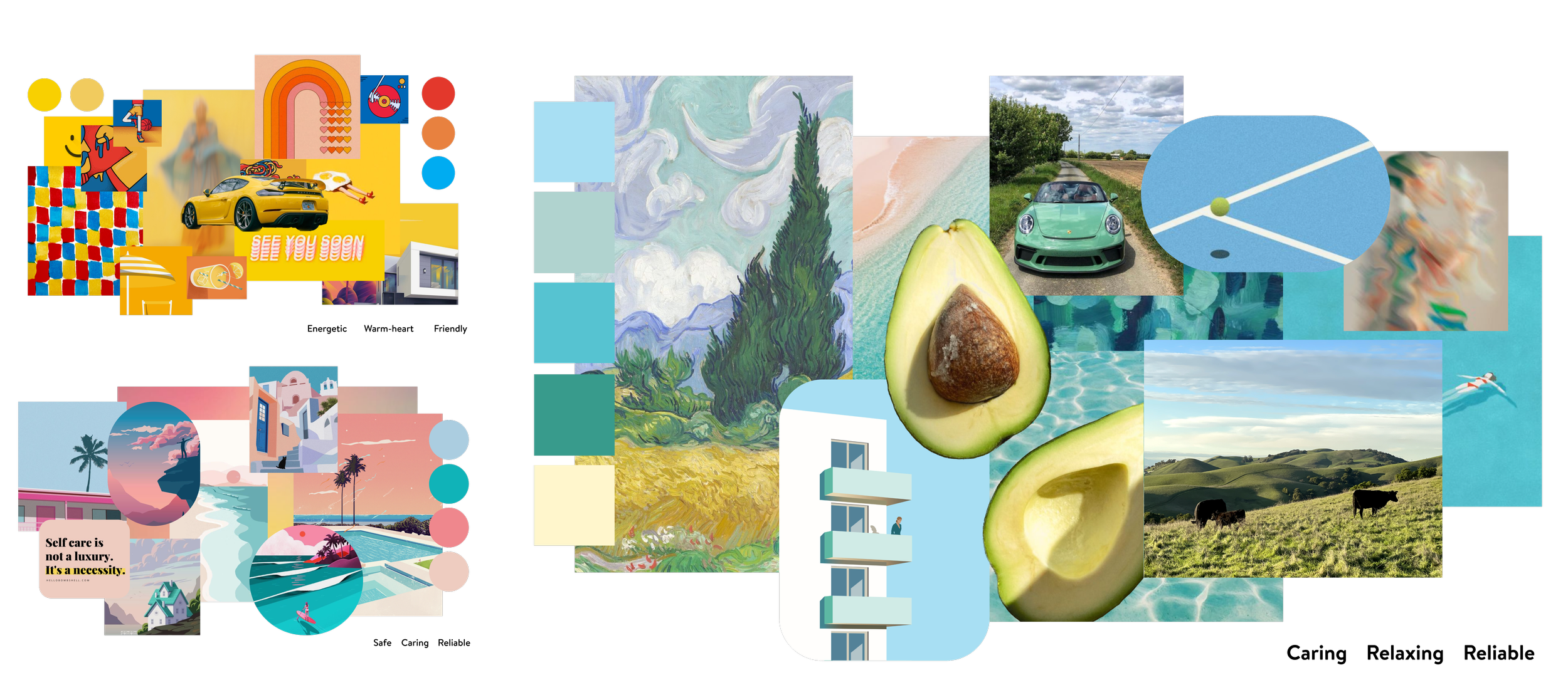
To craft a distinctive and memorable visual identity for Health One, I developed three mood boards, each with unique atmospheres and visual styles. These boards were carefully labeled to reflect the diverse visual emotions they evoked, showcasing the brand's personality.
Subsequent interviews with college students confirmed that the mood board featuring green and light yellow resonated the most. They felt these colors aligned perfectly with a health brand, conveying a sense of Caring, Relaxing, and Reliable, highlighting my brand personality.
Mood Boards
LOGO Design
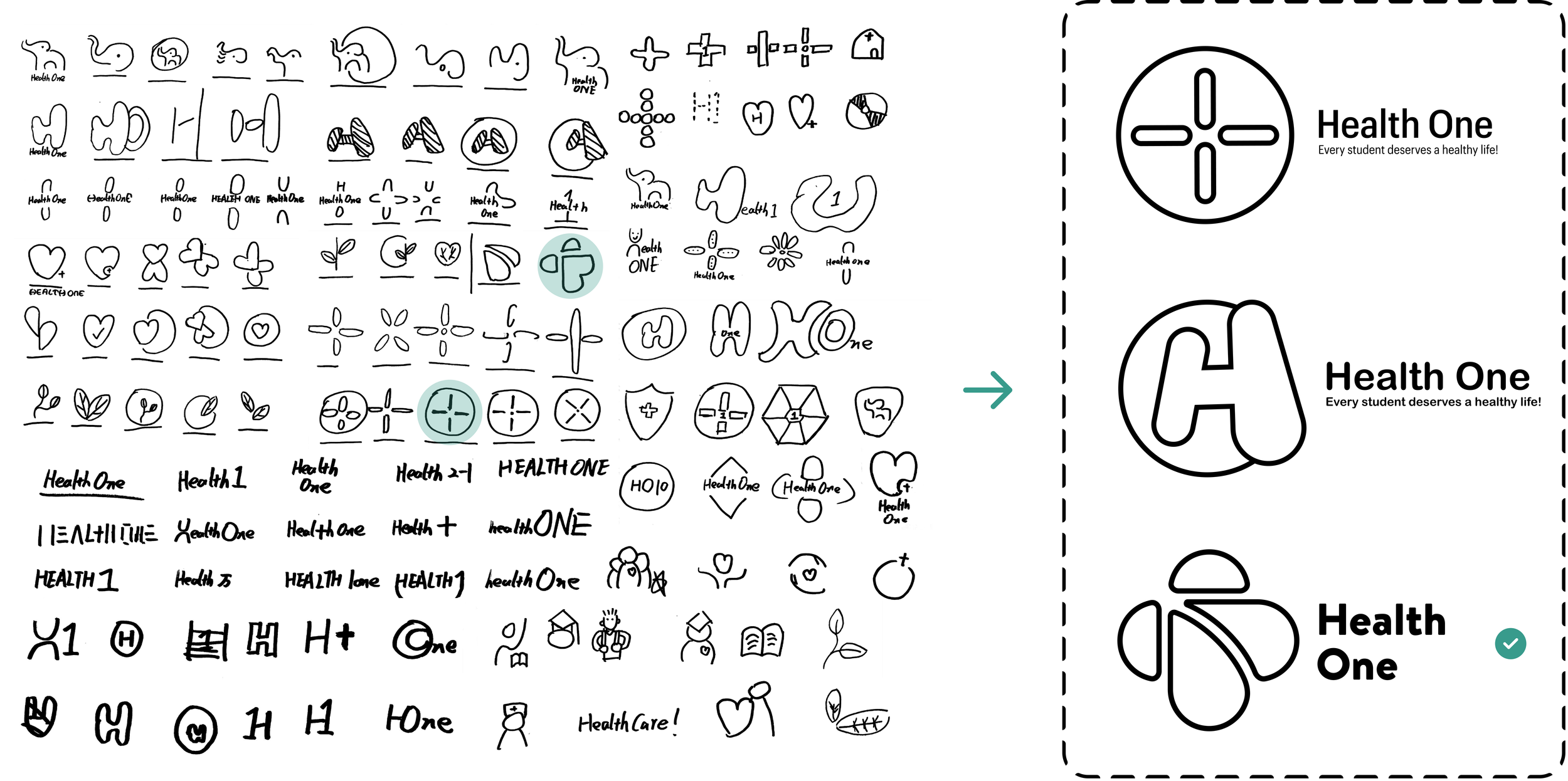
The logo, as the most recognizable symbol of a brand, plays a critical role in brand identification. To ensure Health One stands out and is easily identifiable, I embarked on an extensive design process, designing over 100 logos across 7 categories, including monograms, wordmarks, and pictorial marks. From this diverse collection, I selected three logos that I believe most effectively encapsulate the essence of the Health One.
Following the design phase, I conducted a logo recognition test with college students to gauge the impact of the proposed designs. Based on their feedback, the most memorable and impactful logo was selected as the face of Health One.
LOGO Evolution
The chosen logo design originated from a heart shape, symbolizing Health One's caring and reliable core values. This concept was meticulously evolved to ensure the logo encapsulates these brand traits, resulting in a visual representation that embodies the brand's personality.
Style Tile Developing
Style tiles serve as succinct visual representations of a brand's design elements, offering a more fundamental visual direction than the extensive detail of a style guide.
Aligning with the brand personality, I combined all the design's visual elements to create style tiles, effectively showcasing Health One's unique visual identity.
Web Wireframing
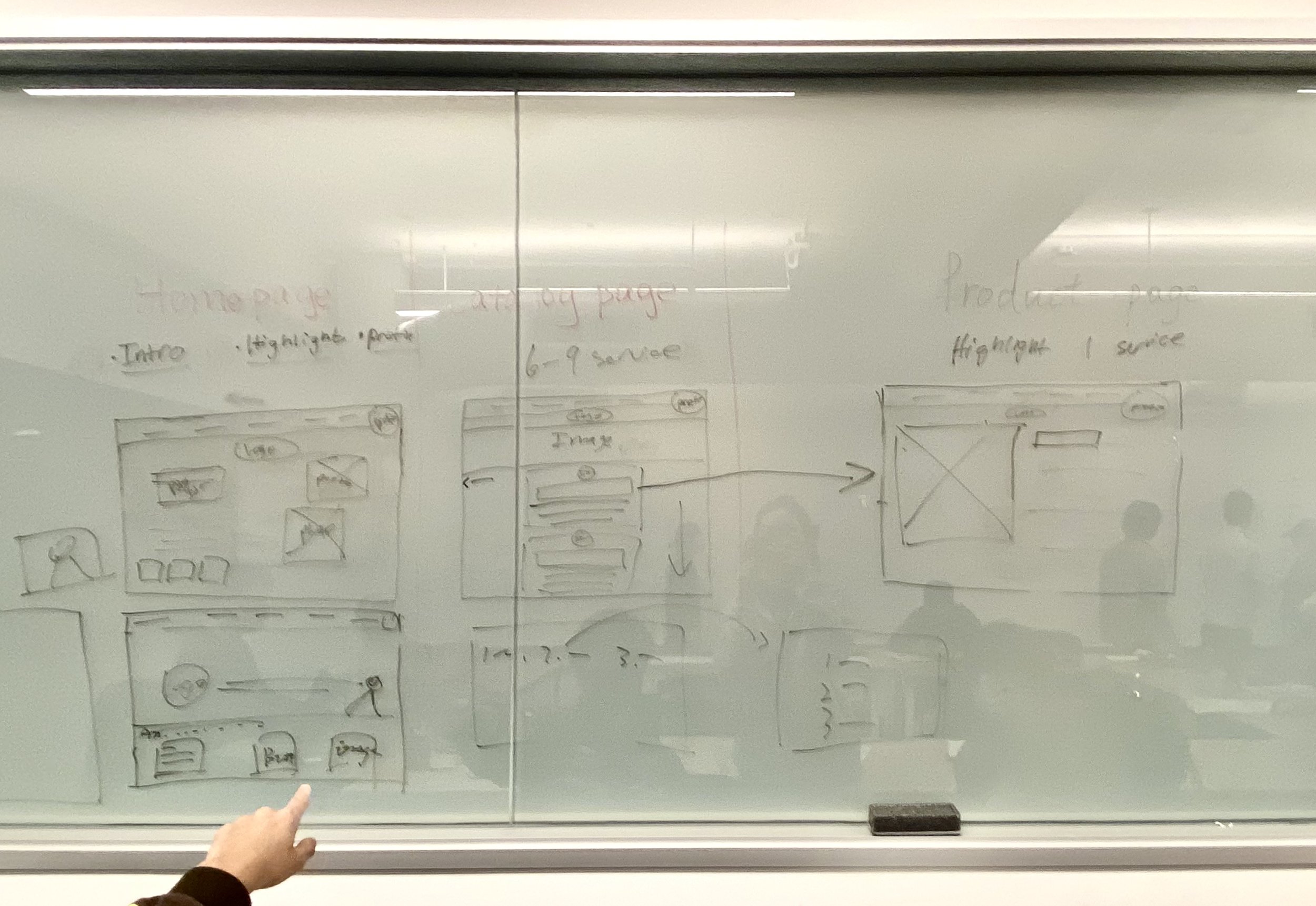
Low-fidelity Web Wireframes
Utilizing a whiteboard for brainstorming, I rapidly explored wireframe possibilities for these pages. This process involved prompt feedback incorporation, which was instrumental in refining and developing high-fidelity wireframes.
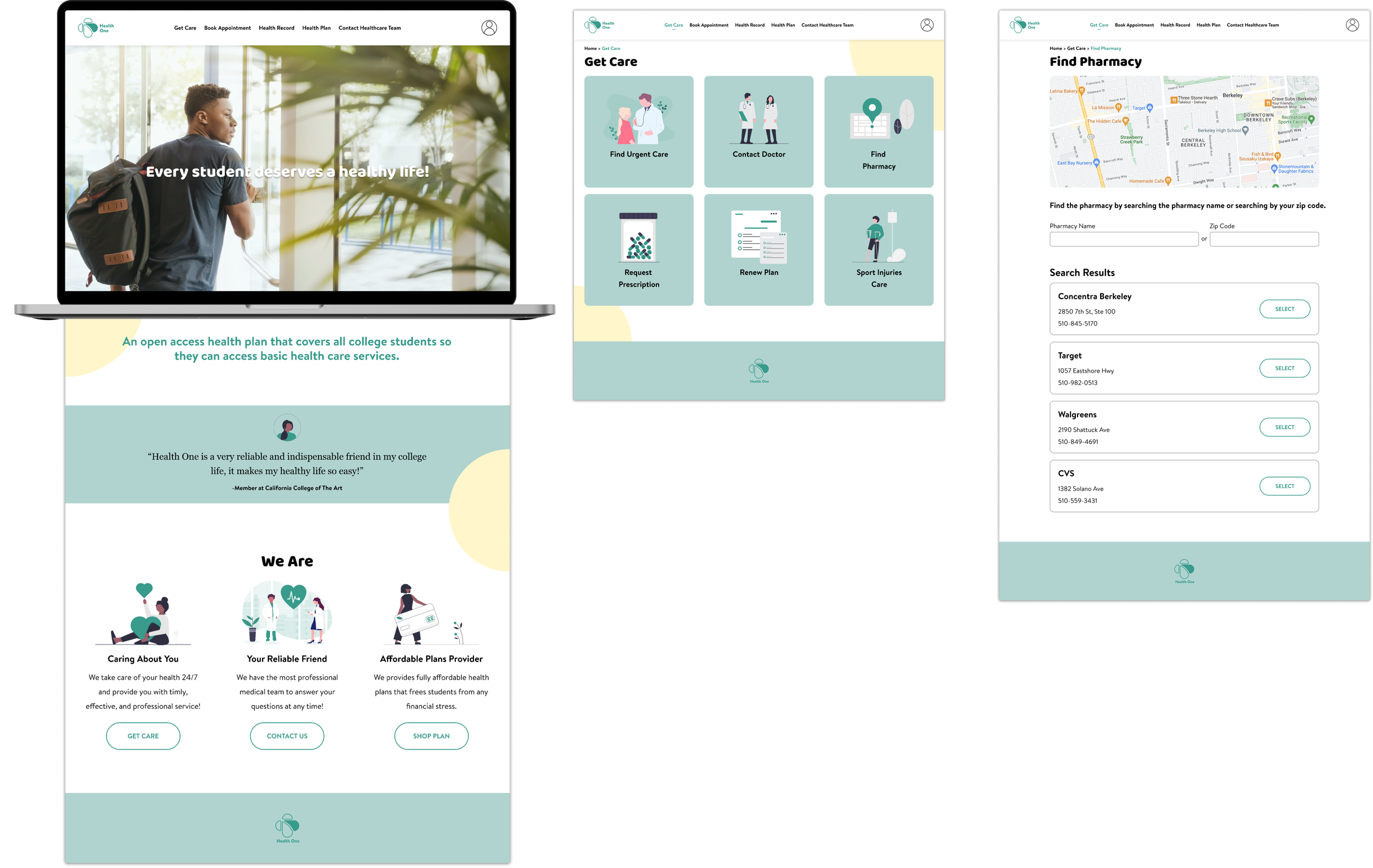
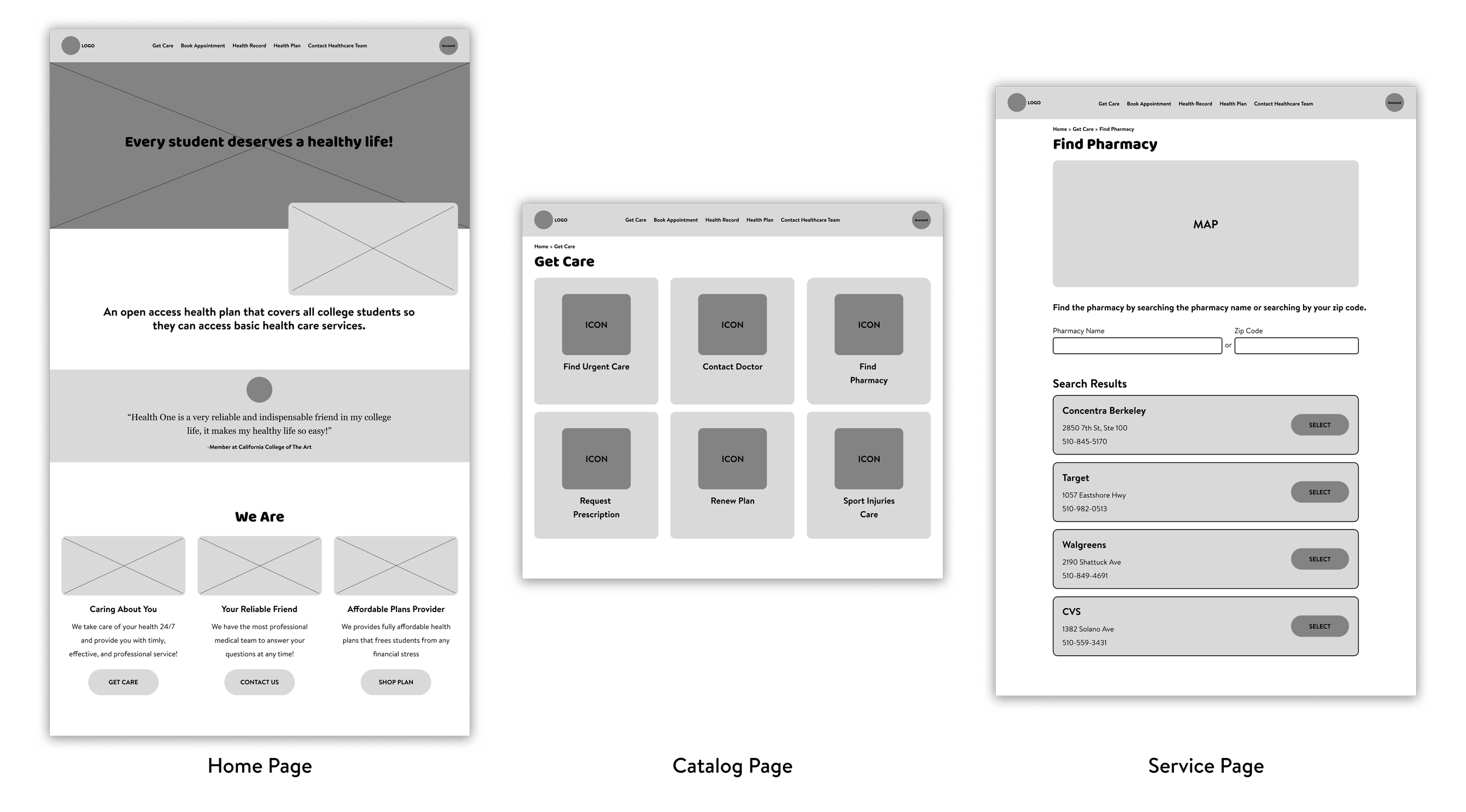
💡 In line with project specifications, the task was to design three distinct web pages: the home page, catalog page, and service page.
High-fidelity Web Wireframes
Mobile Wireframing
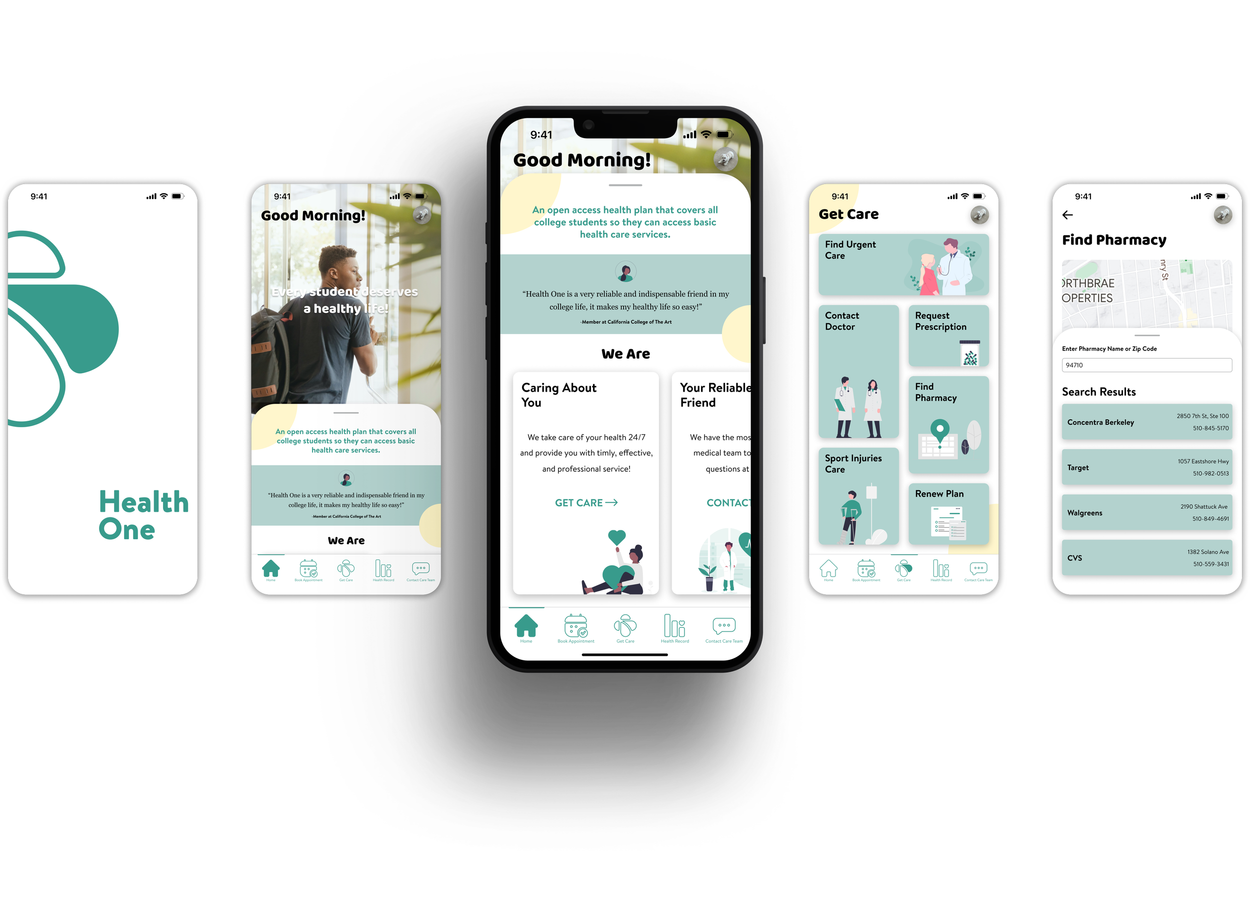
Process of Transferring Low-fidelity Wireframes to High-fidelity Wireframes
Adapting web page content to mobile device interfaces posed a significant challenge due to the stark differences in screen sizes. This discrepancy often leads to compatibility issues, with web information not seamlessly translating to the smaller mobile format. However, leveraging the interactive flexibility of mobile devices, I successfully integrated the design elements and information from the web pages into the mobile interfaces in an interactive and cohesive manner.
Poster Design
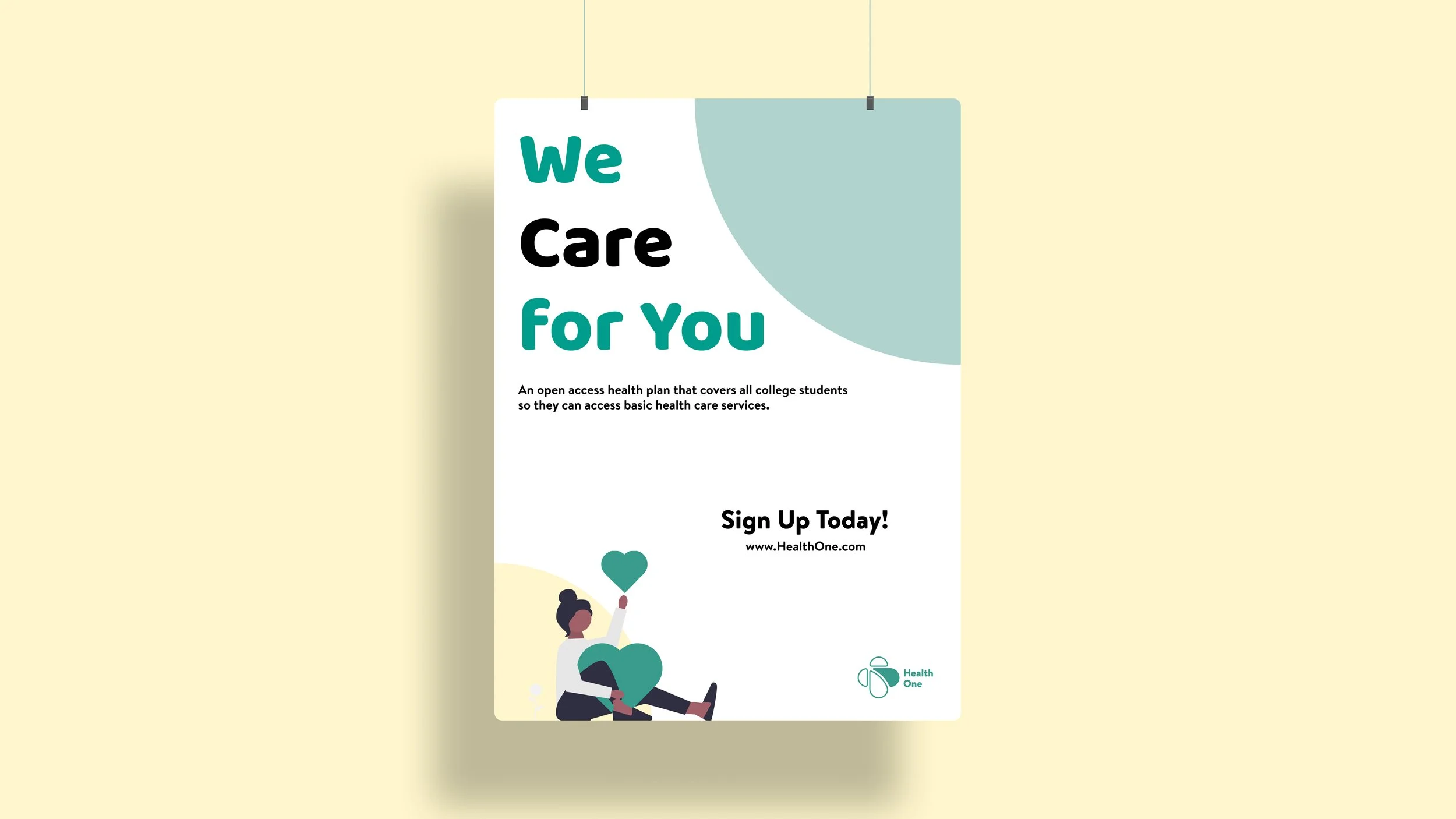
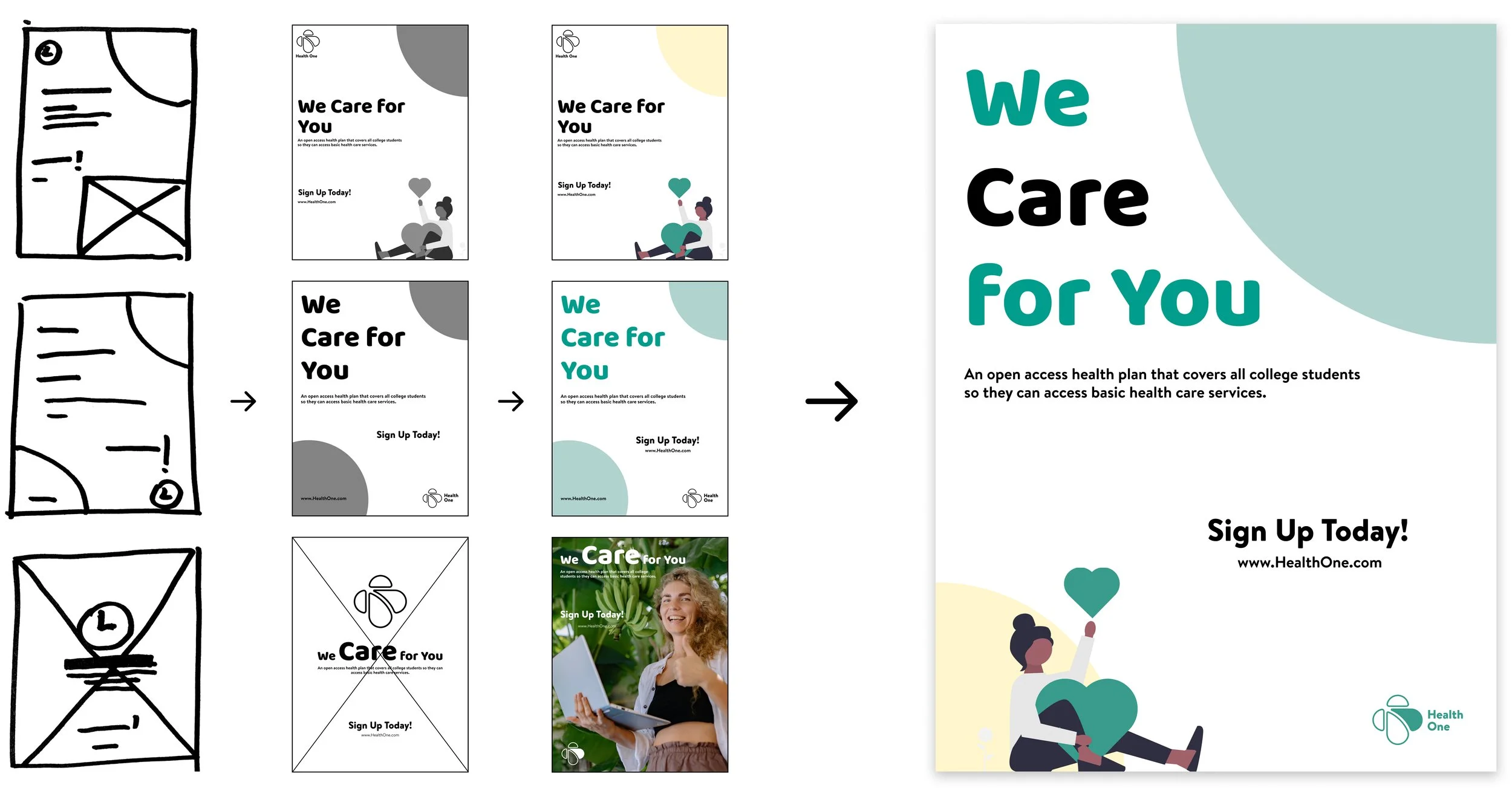
Posters are crucial in brand promotion, especially in engaging college students on campus.
I experimented with diverse poster layouts to effectively communicate Health One's brand message and personality to the target audience. The goal was to not only inform students about good health insurance services but also to resonate with them, encouraging sign-ups. Ultimately, I synthesized three different layouts to create a poster that reflects our brand's tone and motivates users to sign up.
Closing Thought
Opportunities for the future iterations
For next step, I would delve deeper into user-centered design practices, exploring a broader range of visual design possibilities. This approach aims to respond to evolving user needs, further refining Health One's visual identity while pushing creative boundaries. The goal would be positioning the brand at the forefront of visual innovation and user engagement.
Learning & Takeaways
Audience-Centric Design:
The importance of tailoring all visual elements to our specific user group - college students - has been a guiding principle, ensuring that our brand resonates with and serves its intended audience effectively.Value of Iteration:
The iterative design process highlighted that more iterations lead to enhanced outcomes, with each version bringing us closer to the ideal representation of Health One.Embracing Challenges:
Overcoming design challenges has taught me the importance of adaptability and exploration, affirming that creative solutions often lie beyond perceived limitations.
This project has been a profound journey in understanding and executing brand visual design. These insights will be invaluable in my future endeavors in brand design and visual communication.

